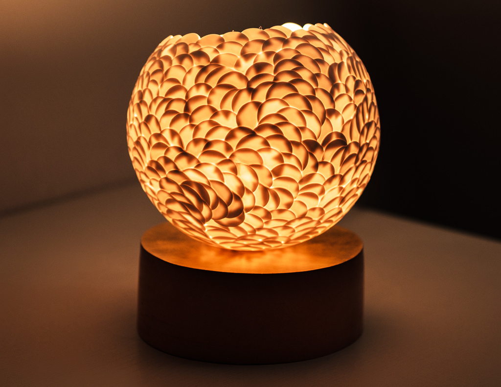
Rousse, série Bonne Aventure, Untitled 36, 2023, Light sculpture in porcelain biscuit, natural bisqued red earthenware finished in 23 carats gold leaf, H 33 x ⌀ 38 cm
Loraine Savary of Rousse tells the story of celestial ceramic works that promise good fortune.
Stéphanie d’Ardier and Loraine Savary met at Arts et Techniques Céramiques in Paris while studying wheel throwing. At that time, Stéphanie was a general secretary for a think tank focused on economic subjects, and Loraine was an editor of fine art books. Over time, they developed a unique method of collaboration, which led to their joint brand, Rousse, in reference to the red moon. They produce sculptural lights and small furniture, bas-reliefs and sculptures.
A childhood passion
✿ So, how did the interest in ceramics begin?
Stéphanie started ceramics when she was a kid, but then stopped. When she was a young adult, she had a dream one night that she would go back to ceramics and put her hands in clay. The next morning, she went on the web and checked for a studio where she could go. From this moment on, it never left her, and she always had her hands in clay while working in other areas. It’s some kind of an awakening. She had this dream, and she couldn’t do anything apart from doing it and going for it.
For me, it’s a bit different. I started ceramics when I was three years old with hand-building, and it’s always been a huge part of my life. When I started working in publishing, I started having really long hours of work, and I needed something to take me out of it, just for a few hours. So I went back to ceramics. I stopped for three or four years due to a lack of time. When I came back, I found a studio in Paris where I could go once a week, and then it was twice a week, and then three times a week, and then I installed the studio in my own flat, in my kitchen. From one thing to the other, it took so much time, and I saw that the passion I had for ceramics was getting even bigger than the passion for books. So I decided to just dive into it and put my whole life, just for it.
So it’s just a childhood passion for both of us. We lived with it differently, but we went back to something that was really carved in us in some way.
✿ I see. So obviously it’s a lot more tangible than being an editor. It’s something you do with your hands, and you have something physical to engage with.
For instance, we made coffee table books also, and some of them were really nice, with the paper and the way it was made. But it’s different because you don’t have the material in your hands, and this material is special compared to wood, metal or even stone. The thing with clay is that it changes throughout the process. When you start working with it, it’s soft and plastic, and then when it dries, it becomes less and less plastic. You need to follow the rhythm of the material and not the other way around.
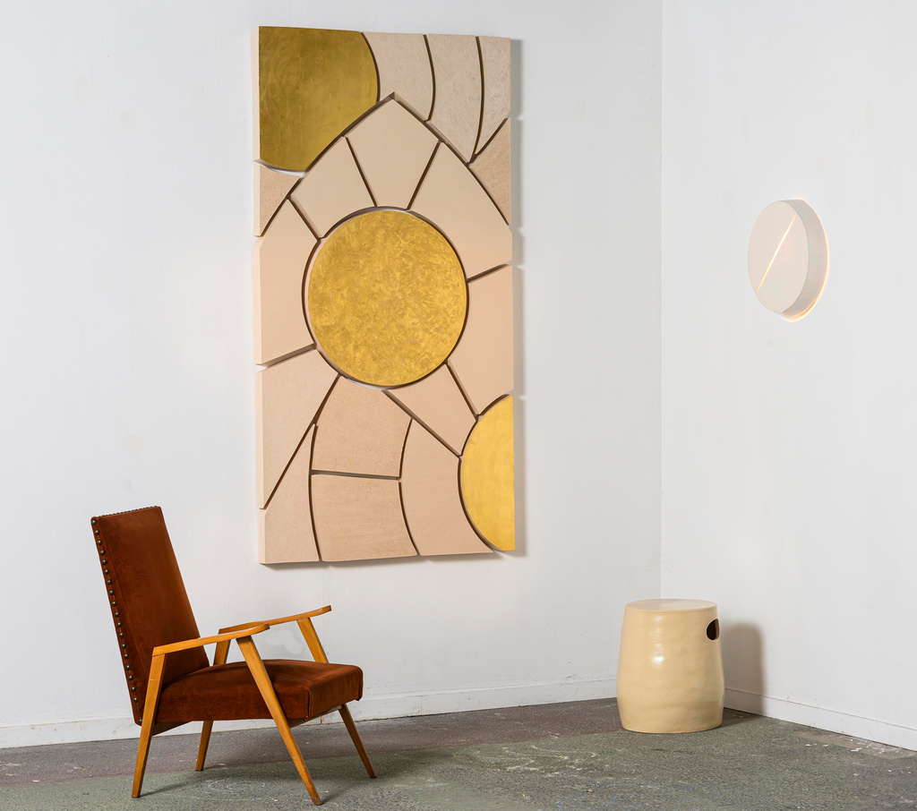
Rousse, série Bonne Aventure, Untitled 80, 2024, Wall sculpture composed of 19 pieces in bisqued white grogged earthenware finished in 23 carats gold leaf and burnished with beeswax, H 200 x W 100 x D 5 cm (left); série Bonne Aventure, Untitled stool, 2024, Sculptural stool in white grogged earthenware with satin clear glaze, H 47 x ⌀ 35 cm (central); série Bonne Aventure, Untitled 25, 2022, Mural light sculpture in porcelain biscuit, ⌀ 39 x D 7,5 cm (right).
Material philosophy
✿ What philosophy underlies your work?
Our philosophy includes minimising clay per project, recycling any little dust of clay, and selecting the appropriate clay for each purpose. We choose porcelain for its translucency, and earthenware (terracotta) for its plasticity and lower firing temperature, which makes it a more environmentally conscious choice than stoneware for certain applications. I have a deep affection for earthenware because its body is really fine, soft, and adaptable. I also deeply love how porcelain interacts with light, creating dynamic plays of shadows. We wouldn’t, for example, do a stool in porcelain because it would be wasteful. We believe that when you create objects, you need to be responsible for what you create.
The Bonne Aventure (Good Fortune) series
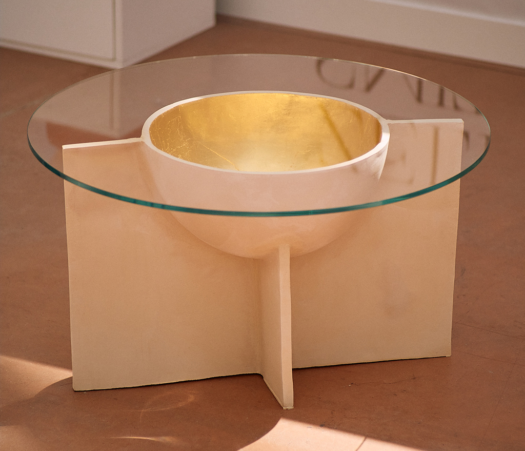
Rousse, série Bonne Aventure, Untitled 83, 2025, Sculptural coffee table in bisqued white grogged earthenware gilded with 23 carats gold leaf and protected with a special invisible impregnation product, and tempered extra white glass tabletop, H 47 x ⌀ 80 cm.
✿ What’s the story of your Bonne Aventure series?
The Bonne Aventure series emerged from an unexpected collaborative process. We started by exchanging advice on our individual pieces, and it solidified when a commission led us to draw together. Something happened that we don’t even know how to explain, and from that first piece, we sketched a whole notebook of ideas. Since then, we’ve worked together in a way where we no longer know who does what in our pieces.
Our collaboration is very intuitive, similar to children playing. When kids play, they don’t explicitly direct each other; they just do it, and ideas flow freely. It’s a creative life intertwined with our personal lives.
We often create individual sketches for projects, and then we combine elements from each other’s drawings.
We often create individual sketches for projects, and then we combine elements from each other’s drawings. We frequently use translucent pages to overlay and manipulate designs, keeping core lines while introducing new elements. The moment a design “works” is an intuitive realisation. We recently completed a design in half a day, and we don’t know how we knew it was finished, but it just was.
The crystal ball was an iconic object that had become outdated but gained relevance again with a renewed interest in spirituality. Our reinterpretation used porcelain’s translucency to play with light. We created a rounded sphere from small, superimposed half-coins to form a pattern resembling a palm leaf. The goal was to infuse the object with a sense of mystery, moving beyond its traditional association with divination, and symbolically bringing it to life.
The name “Bonne Aventure” was inspired by the reader of fortunes. The series itself explores themes of fate and destiny through everyday objects transformed into sculptures. These are not just lamps or tables, but sculptural lights and side tables designed to hold a special place in interiors. The series’ vocabulary is rooted in spiritual architecture, incorporating pure lines, curves, and small elements that together create a cohesive whole addressing fate, destiny, and the influence of stars in both astrological and astronomical contexts.
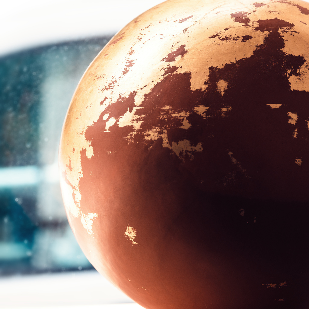
Rousse, série Bonne Aventure, Untitled 40, 2023, Sculpture in bisqued red earthenware finished with 23 carats gold leaf, ⌀ 40,5 cm.
We use gold leaf to represent stars, the sun, and the moon, adding a sense of light without external illumination. The gold leaf also highlights the clay’s texture, allowing for different nuances and creating a distinct play of light. For instance, a piece inspired by spiritual architecture and stained glass combines different elements to create unity through dissociation, with three central elements highlighted by gold leaf. The textures, like the scratched clay in wing-like forms, are designed to give a sense of expansion to the viewer. Elements like a small gilded rounded shape feature a spiral pattern to draw the viewer in, while a larger central shape has different scratch directions, creating visual contrast that highlights the clay’s colour. This intentional use of texture and light aims to entice the viewer and reveal new meanings.
The sphere, a central symbol in our work, represents fate, life, and time.
The sphere, a central symbol in our work, represents fate, life, and time. It’s meticulously crafted to conceal its construction as two halves, challenging the viewer to understand its making. The torn, old-like effect of the gold leaf on some pieces, achieved through a precise and random application process, symbolises that “life has scratches”. Some unique pieces, like those relating to the “Lunaris” or “red moon” concept, were born from serendipitous accidents during creation, which we liken to the “Kellogg’s effect” [the failed attempt to make granola that resulted in “corn flakes”].
We have created close to 90 pieces in this series, maybe more. We don’t intend to close it. We prefer to see where our creativity leads us. The series is guided by a consistent thread of shapes, lines, curves, and light play, with each piece inspiring the next. It’s an open-ended artistic journey.
The series is profoundly human, celebrating our creative partnership. It wasn’t made on purpose, but the name “Bonne aventure” also signifies “good adventure,” and for us, it’s not only a creative or artistic adventure; it’s a human one because we met each other. If Stephanie were here, she’d agree; we’re like “the two birds that are inseparable”. This truly human aspect is really important to both of us. Our studio, full of light and plants, serves as the nurturing environment for this ongoing human and artistic journey.
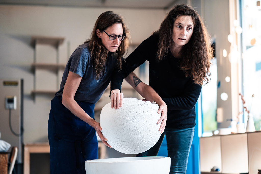
The founders of Rousse, Loraine (on the left) and Stéphanie (on the right), carrying a ⌀ 45 cm sphere piece in raw porcelain, to apply its finishing touches before firing it.
Where to see
- Paris Design Week 17-20 September, 2025
- Artisans d’Excellence 2-4 October, 2025
Visit rousse-ceramics.com, follow @rousseceramics and read the Homo Faber Guide profile.