
Anthea Boesenberg is a Sydney artist with a thirty year career in printmaking. She was interviewed by Mark Stiles after her most recent show JOURNEYS at the Concourse Art Space in Willoughby.
Mark: You have a long association with the Northern Beaches in Sydney, don’t you?
Anthea: Yes, I first discovered printmaking at Seaforth TAFE where I was introduced to photography and sculpture as well. Later I studied for two years with Paul Smith at Manly Vale where he had a studio and I was allowed to use his facilities. I admired his work and he was a generous teacher. There was a lovely cooperative community there which became the genesis of the Warringah Printmakers Studio. When Paul left others stepped in to keep it going, including me, and I eventually became its president. I combined teaching and printmaking for nearly twenty years. I enjoyed teaching but I eventually decided I needed more time for my own work.
Mark: Was this when you set up your own studio?
Anthea: That was in 2006. It was the first studio I’d had that was really my own. It was tiny but I was independent now with no other commitments and I could really channel my energies into my work. I’d learned a lot professionally at Warringah and I carried that forward, for example using non toxic materials and avoiding acids and things like turps. I became more and more interested in alternative printing processes and moving beyond 2D prints. I was after a much more direct transfer of the image that could involve incorporating what others might call mistakes in the making. I like things that are not perfect as a way of honouring the imperfections of things made by hand. In a way my practice has become very Eastern.
Mark: This has involved thinking about materials…
Anthea: Yes, I’ve been on a journey of my own working with materials of different kinds. I see the end result as a collaboration between me and the material I’m working with, experimenting wildly to see what happens, and finding out to what extent I can manipulate it or leave it alone. This means that my next show may look completely different from the last one depending on the materials I use. The finished works are stopping off points on this journey of discovery, and you could say few of them are ‘finished’ in my eyes. Perhaps I could push them further.
Mark: How would you describe your new work?
Anthea: At the moment I’m using a combination of monotype and mixed media. I like to think they’re where my hands have taken me. If I’m going to explore these materials I owe it to them to see what happens although I’m always drawn back to printmaking techniques like using a stencil or a stamp.
Mark: You’ve also been experimenting with presentation…
Anthea: Yes, another aspect of my practice now is trying to escape from the frame. I’m really interested in creating beautiful surfaces but I don’t necessarily want to put them under glass. Using wax encaustic is one way of doing this, since the wax can protect the surface from dust and degradation. On the other hand sometimes glass can contribute to an image where the viewer’s reflection can place the viewer within the image. That happens with these grids I’ve been making of images encased in CD covers, which suggest the gridded facades of office blocks.
Mark: There’s something of an architectural strain in your work, talking about grids and materiality. Would you agree?
Anthea: I did think of becoming an architect but I grew up at a time when only the bravest women did anything other than teaching or nursing. I wasn’t particularly brave. I would have loved to study architecture but I never did. That said, architecture is about the manipulation and organization of space and thinking in 3D and I think my practice is moving towards 3D. I thought, why does my work need to be 2D? Surely the choice of the right material brings an extra dimension to the work, so I started doing things like folding the work so that light could penetrate through layers, arranging things on a surface to create a fluid form and hanging pieces freely in space.
Mark: Your latest show has certainly explored a range of materials and combinations…
Anthea: Yes, there’s wax monotypes, images made with burnt paper or rust, ink and pencil on Mylar film, and polymer intaglio and relief prints. I’m trying to push things just to see what I can do with them, how to make materials behave, hence the use of the architect’s drafting film for example. But I’m also interested in things like scale. A large piece has different requirements from a smaller one. I commonly tear things up if I’ve got the scale wrong. It might be delightful at a smaller size but not at another. I did make a huge print once [“Emergency Sky for Chicken Little”] but there was no wall in my house big enough so I have resorted to putting it on the ceiling. I would love to find a way of making images without edges.
Mark: Is that what your Near the Fenceline series does?
Anthea: The images in Near the Fenceline seem to go on forever, but the edges are still important. I’ve explored this idea in other ways, by making films and videos. This last exhibition is the first one in a while where I haven’t incorporated video works. For the Lucent show (2015) I made a video of the light bouncing off the surface as a man swims laps in a pool and the way the surface of the water would go from agitated to calm to agitated again without end. My friend Richard Bevins created a soundtrack for it which made it even more mesmerising.
Mark: How would you describe your practice now?
Anthea: I see my work as stopping places in a journey – once I’ve moved on, I’ve moved on. I may cannibalize old works to make new ones. I used to do some work for Dick Watkins who keeps everything, every little sketch, as a complete record of his practice. My whole practice is based on learning and I tend to lose interest once it’s made, I don’t necessarily want to make something similar again. Because this is a personal journey I’m not interested in the gallery system or the commercial side of things. I think it’s why I can commit so much to the work because I’m not relying on someone else’s opinion. I can’t think of anything worse than doing exhibition after exhibition and repeating myself.
Individual works
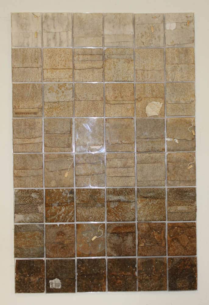
Anthea Boesenberg, 680 minutes, rust on paper
I’ve recently become interested in making work using CD cases as precision containers that contrast with the handmade work I put into them. 680 MINUTES is a time-based piece made by exposing Japanese paper to a metal surface in ten minute increments. It was kind of a science experiment to see what would happen: I’d lay the paper on a steel plate and spray it with water and then add tags and numbers and other detritus which was part of the process as I went along. By the end I was using stitching to hold the paper together and that became part of the work as well. Folding the paper to fit into the CD cases also contributed something to the image as did the reflections of the cases when I hung them together. I like the contrast between the natural entropy of the rust and the machine-made rigidity of the cases. The rust will continue to change over time and hopefully the work will become even more beautiful. One could say the reflection of the viewer in the plastic CD cases reminds us that we, too, are part of the cycle of entropy.

Anthea Boesenberg, Landfall 2
This was in the Sydney Printmakers’ 55th Anniversary show at Artsite Gallery. In a previous life this was a piece called “Entropy”, big sheets of heavily rusted paper that I stitched together. When it I submitted it to the North Sydney Art Prize it was hung in a shed that was open at the sides, and after two weeks it had became extremely tattered. I really liked what the wind had done to it so I folded it up and added extra stitching to make this new piece which is now in a box frame. The title seems to be about arriving somewhere by boat, like MONA, and seeing the rusted metal carapace of the building and then finding those sandstone vaults inside, using materials in an extraordinary way. Or the sandstone cliffs as one arrives by boat into Sydney Harbour. I liked the random re-combination of pieces and the way you could make repetitive patterns this way, something I’m very interested in. The results are mostly unpredictable but I can make an educated guess about what will happen.

Anthea Boesenberg, Found image 1, plymer intaglio, relief print, cd covers
This was produced using conventional printmaking methods except that I cut up the printed images and put them in CD cases to make a 7 x 9 grid. The original image comes from a photograph I took of some roadworks near my house where the large painted metal plates laid over the excavations had become scratched and marked by traffic. I walked past this spot for six months and each time I saw these plates in a slightly different way. The emerging image was strikingly beautiful and I was determined to capture it in some way. I photographed the plates and converted the photograph to a polymer plate and printed relief intaglio before cutting them up. The CD covers are highly reflective and include you in the image which emphasizes the urban nature of the print.
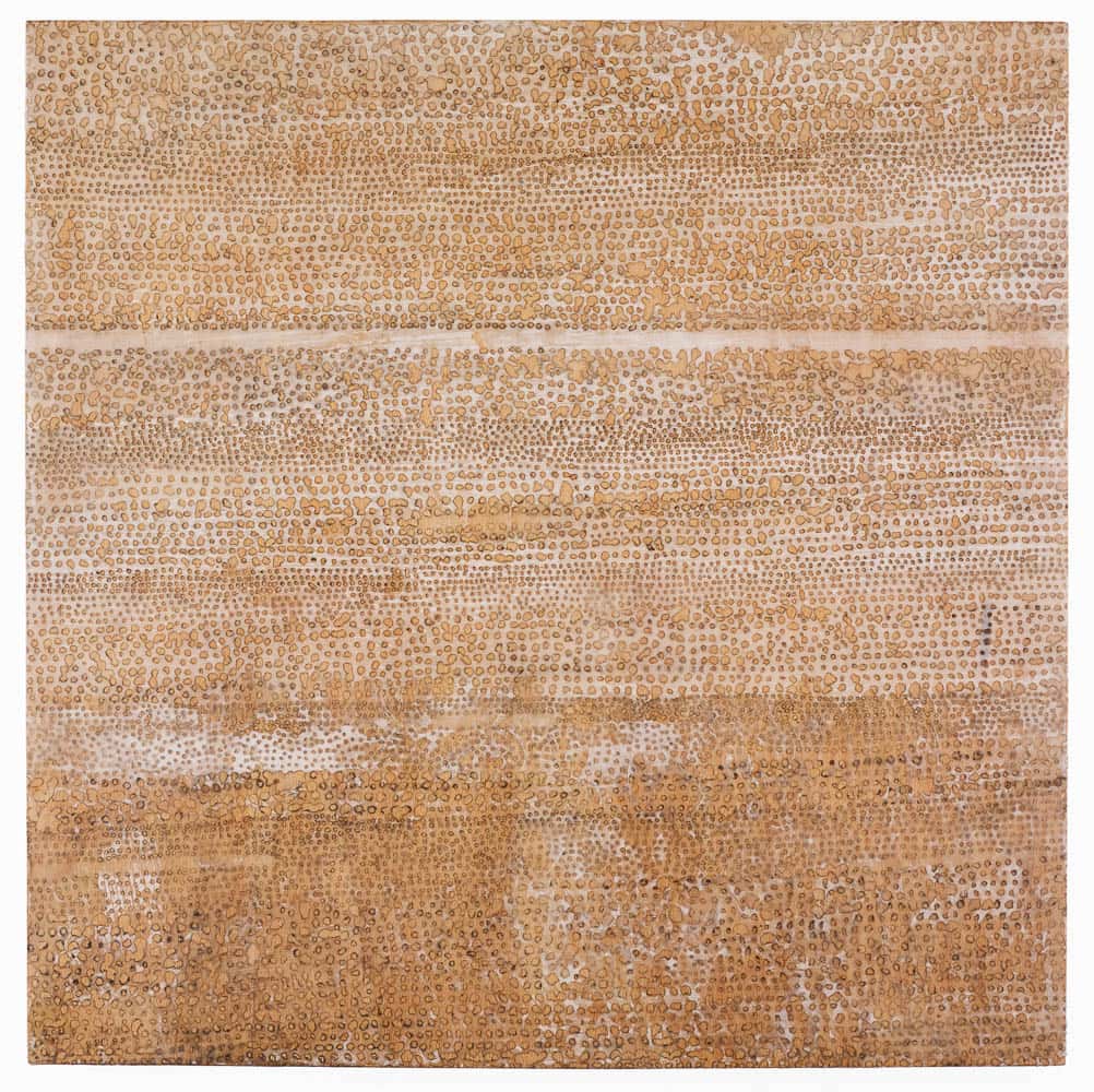
Anthea Boesenberg, Grasslands, 2016, burnt paper and wax
This is a image consisting of three horizontal bands on a single sheet of Japanese paper. The bands in turn consist of hundreds of tiny holes burnt into the paper using an incense stick. This was a real exercise in pushing a material to its limit, taking an already fragile material and testing it, making it more fragile, even before I knew how I was going to use the results. I accidentally set fire to the paper at one point and had to stamp it out but I was still able to use the fragments. I’m very attracted to processes which take a long time, that may be very simple and repetitive and slow, but become intensely meditative. The stains made by the smoke were a gift that depended on the moment – if the breeze dropped I’d get a run of darker holes and the minor variation in the details attracted me. There was a further option for manipulating the image when I was waxing it to the backing board : I could burnish it to give a golden brown look or allow the white of the paper to show through. The thin white stripe in the middle of the image is an area where I didn’t make any holes, making decisions as I went along. I did try other ways of making the holes but they were too even, I wanted the irregular sizes I got this way. The final result is deliberately mounted not framed and looks a bit like old papyrus. I would argue that this is a print. It is a handmade stencil which has been waxed to the backing board, uninked.
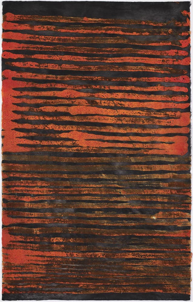
Anthea Boesenberg, Journeys, 2017, wax pigment and ink
This is a pigmented encaustic wax and ink monotype that came out of a recent residency I did in Mildura. Mildura is five hours’ drive from Sydney and to get there you have to cross the Hay plains. After I made it I realized the work was about that drive, driving for hours with that constant horizon. I organised the residency in Mildura myself because I wanted to experience another landscape. I went by myself because I didn’t want a social time and that was crucial. All I did for two weeks was visit various landscapes around Mildura, return to the studio and work. It was amazing, the work just flowed out of me, I was completely in the moment, not thinking. It was a wonderful experience and nearly half the pieces in my last show came out of it.
Anthea Boesenberg, Pink lake, pigmented wax monotypes, ink, transfers
This is also from Mildura though Pink Lake is actually in Victoria. The lake is a dark moody pink because of the salt incrustations on its surface which don’t reflect the blue of the sky, and a growth of pink algae. In this piece I tried to capture that mood, pushing the material (Japanese kozo paper) as far as I could. If you take it out of the frame the paper feels like worn cloth, like the country itself, old and worn down.
This piece is also a print: repeated pigmented wax monotypes to build up the surface until the paper would absorb no more – a slow and measured process. I added a little Sumi ink at the back of the paper and some fine lines were transferred onto the surface. The piece in the centre is other side of the paper from the two at either end.
The rough torn edges to the print are important to give the piece an unending feeling, as though it’s trying to escape the frame, but in this case I used a frame to add a sense of value to the piece. I am saying that these remnants of an ancient landscape need to be protected.
Comments
Love this! You are such a font of originality and inspiration.
Very inspiring, particularly the Mildura relationship to the landscape prints.
Thank you for sharing, your journey is inspirational and congratulations on a beautiful exhibition.
Thank you Anthea. I understand your desire. too. for release from conformative print-making.