-
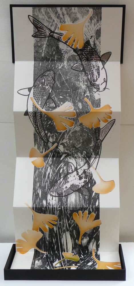
- Taki, full image
-

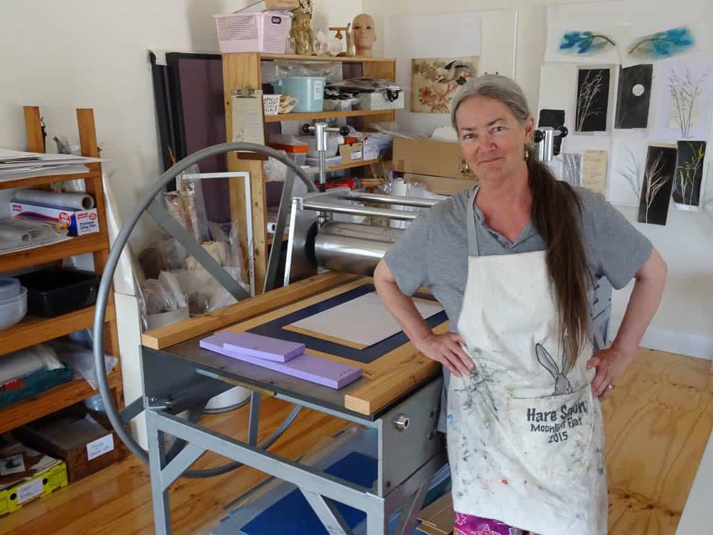
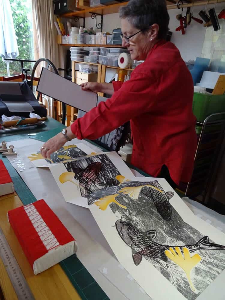
- Rhyll Plant with the press
-
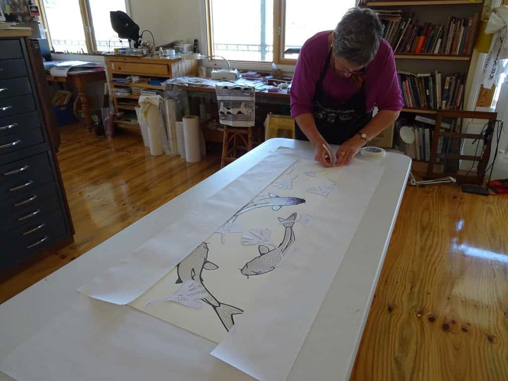
- Laying out for printing

-

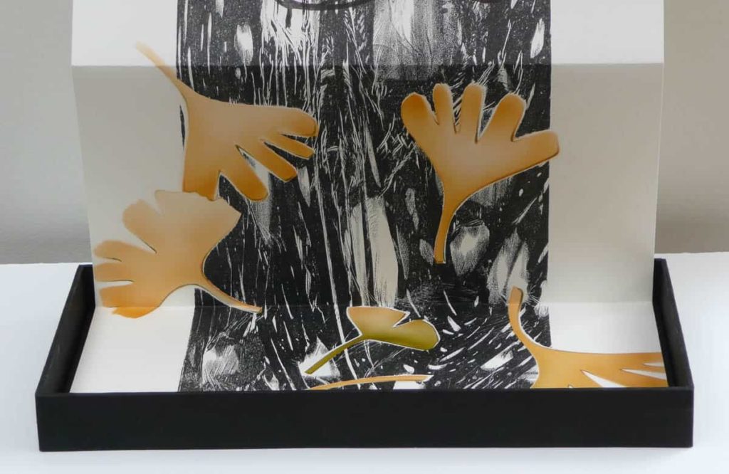
- Ann Baxter with mock-up book
-
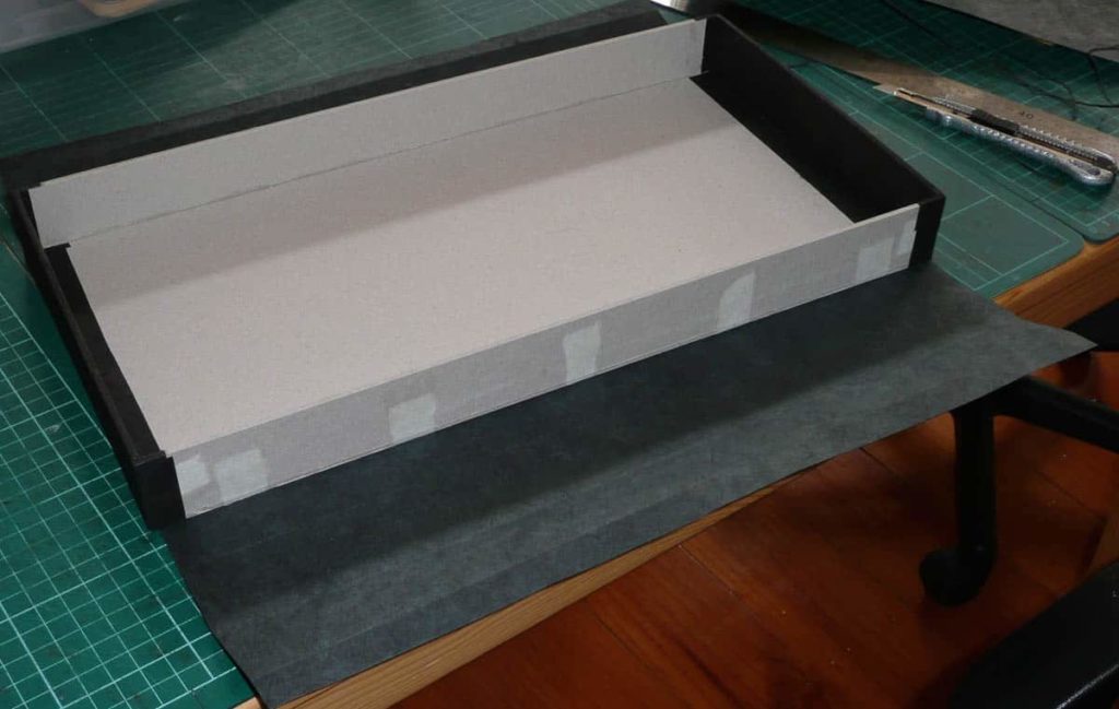
- Box/book under construction

-
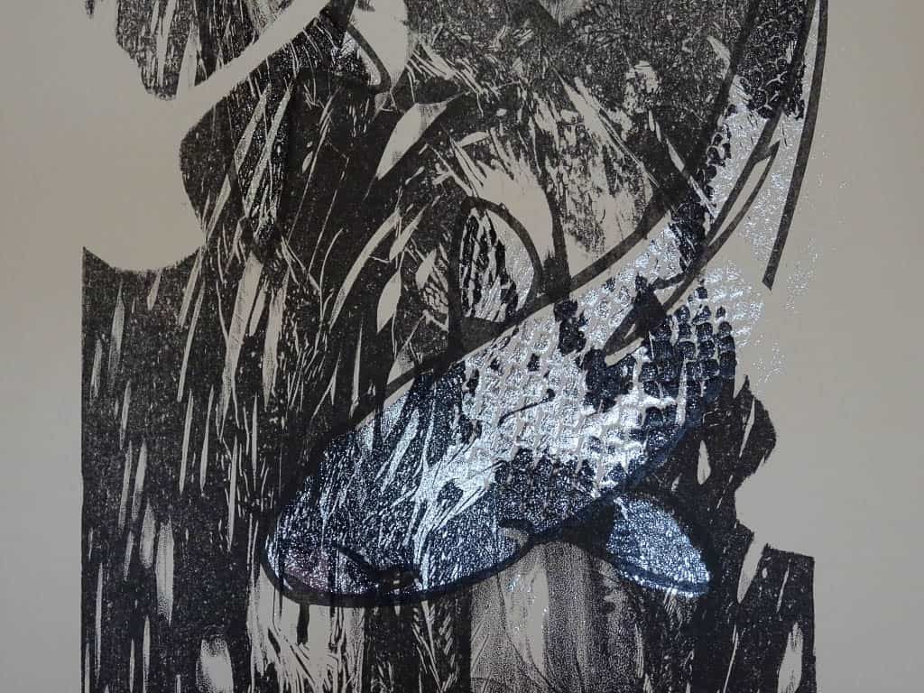
- Silver Koi, printed over

-
- Ann Baxter doing final fit of book and container
-

- Assessing hanging
-
- Taki at base of box

-
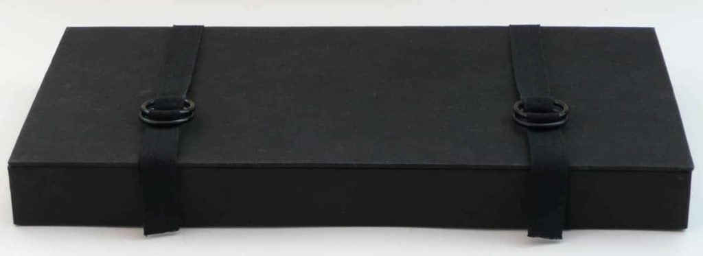
- Box by Ann Baxter

Scientific illustrator Rhyll Plant and bookbinder Ann Baxter collaborated to produce a concertina print in a box depicting a Japanese-inspired scene of fish descending in water.
The book
Print Dutch Aquatint (Schut Papers) 350 gsm, screen and relief print, hand coloured.
Box Nepalese handmade Lokta paper over boxboard, Van Gelder book paper.
Size: Closed: L395mm X D200mm X H45mm
Open: L395mm X D200mm X H880mm
Edition: I, II, III with different colour variations. Editions are all unique state.
Collaboration
The challenge with any collaborative work in the arts is for each practitioner artist to allow the other breathing space, while still being true to their own area of interest and skill. A listening respect is essential.
Rhyll Plant: designed the image; screen-printed, relief printed, monoprinted the images, and hand-coloured each of the prints.
Ann Baxter: designed and constructed the purpose built container using Nepalese Lokta paper, and attached the print within the box. She also assisted with some aspects of making the print. The container/box was constructed from scratch, and had to have a covering that both contributed to its stability, and provided a slightly textured, rich-to-the-touch surface.
The idea
Rhyll: Memories of visits to Japan influenced my imagery when the opportunity arose to explore a theme for a collaborative artwork.
The carp in the waterfall is iconic in Japanese and Chinese art. Legendary fishes were said to vie to be the first to climb the waterfall where they would become a dragon. I could tell you that it was some inner desire on my part to strive (like the koi) to be the best I can, and though there is truth in that, it is also likely that I just really enjoy making designs with that fluid fishy shape. I also love being in Japan at the time when the ginkgo leaves fall in droves and coat Kyoto in yellow!
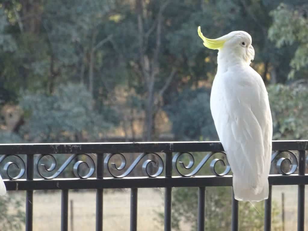
View from Rhyll Plant’s studio
I live on four acres of grass and bush which we share with kangaroos and many types of birds. The photo is one bird of a gang of sulphur-crested cockatoos that create a cacophony of noise out here
In contrast to the view from my studio of a hot, dry Castlemaine landscape with its sweeping horizontal vista, the concept of creating a design based on silver koi fish gliding beneath a scatter of fallen ginkgo leaves within a cool, cascading waterfall was appealing indeed! It takes lots of coffee to plan and create a single unique artwork that fulfils the ideals of two artists with equal expectations of quality and precision.
Ann: I was initially reluctant to undertake the project, but reasoned that it would be a fantastic opportunity to learn. And Rhyll can be persuasive! The project began with a horizontal idea, but soon evolved to the vertical with my interest in “containers” for not only material things like liquid, but also for thoughts and ideas. In Taki, the waterfall is the container for the Koi and the water, and the box is a container for the print. Together they are the artwork. The work also reflects the truly collaborative nature of the project, being equally weighted (50/50) in the print and its container.
Techniques
Rhyll: The making of the complex multi-layered artwork Taki enriched my skills as a printmaker. With only our own guidelines of trial and error, I made samples to test the tolerance of printing papers to be wet (screen printed glue) ironed (silver foiling) squashed through a heavy etching press (relief print) and emerge perfectly flat to receive background ink and airbrush colour.
So far, so good, three finished full-size artworks are made, but Taki is not complete as a long narrow wall hanging, it is destined to be a folding book.
Ann: The artwork had to clearly allow the viewer to “get” the idea of waterfall and container. The book/box had to contain the print precisely and be able to be closed to acknowledge and contain both the idea and the art. There was little room for error. The book/box had to sit on a flat surface as an artist’s book, or hang freely as a long wall piece, sans the box, or both, falling as a waterfall down into the container. The “lid” had to fit exactly and and act as one end of the “book” cover.
The treatment of the art had to be such that it could be unfolded and refolded without damage. To this end reinforcing was necessary, and great care needed to be taken with how the heavy print paper was folded so as not to damage the print.
Castlemaine environment and Castlemaine press
-

- View from Ann Baxter’s studio
-
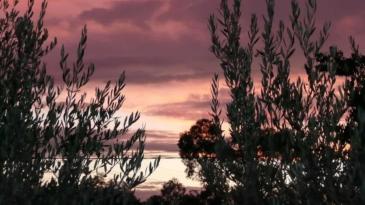
- View from Ann Baxter’s studio
Castlemaine Press is a new venture. The title of the exhibition ’50/50′ reflects not only collaboration, but also a celebration of 50 years of existence for the Print Council of Australia. Castlemaine Press encompasses a wide range of different print practitioners within its membership, reflecting the diversity of the people who have chosen to make Castlemaine and its environs home. It also reflects the history of the area which brought together people from many and diverse backgrounds to mine the goldfields.
Footnote
According to Peter Stanford who supplied the paper used for the box, “the paper is made from the Lokta plant which is a species of Daphne grown in the Himalayan mountain region at an altitude of 6,500 to 10,000 feet. The Lokta plant can grow to 10ft tall and is around 4 years before it can be harvested. This perhaps the only paper which is absolutely free from any chemical treatments. There is no bleach or chlorine used in the making of this paper. It is totally natural. The paper I have is not made from recycled or waste paper even though some does have that look. I have an agent in Nepal who sources the different types of paper from surrounding villages in the surrounding mountains.” This paper was chosen by Ann and Rhyll for its strength and stability.
Authors
 Born at Phillip Island, Australia, Rhyll Plant’s early association with natural history was stimulated by her close proximity to the sea and her parents’ particular interest in marine zoology. A youthful love of art and museums led to a full time career as technician and scientific illustrator with the then National Museum of Victoria. Decades later and Rhyll lives in rural Castlemaine and is an Honorary Associate of Museum Victoria where she continues to illustrate scientific publications. Rhyll runs workshops where she shares the skills gained through the completion of a Masters degree in visual art (printmaking) at LaTrobe University, Bendigo.
 Ann Baxter began her art life with ceramics, and an incomplete Diploma of Visual Arts. She explored felt making but found her home in papermaking, bookbinding, and printmaking, through numerous workshops and supplemented her skills with observational drawing and a Certificate in Creative Writing. Her interest in paper has gone from the traditional sheets, to more non-traditional forms, to constructing work that tells a story. The written word is important to her and she often weaves stories around the work she produces to give the pieces a history—a reason for “being”. She worked in private industry and the public sector, in non-arts related roles, for more than forty years and is now “retired”.