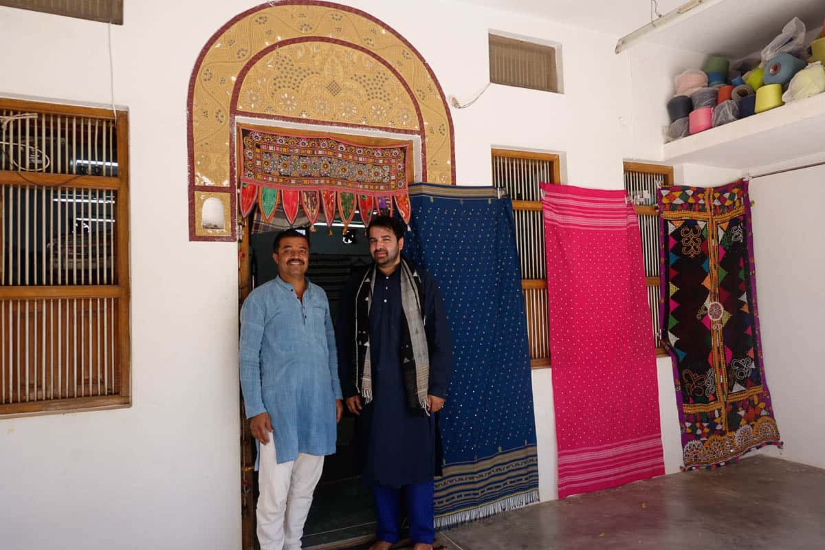
Ishan Khosla standing under a toran with renowned weaver, Shyamji Valji Vankar
Situated in the North-West part of Gujarat, Kutch is largest and arguably the most diverse district in India with an area of about 45,000km². I visited the rugged and evocative Kutch for the first time seven years ago to seek out an artisan and style of embroidery with which I was to create a logo for Sangam (the Australia India Design Platform). Yet again, I am beckoned to this wonderful land to work on yet another logo design, this time, to represent the district of Kutch itself.
Mieko Komatsu, representing Hankyu, the second largest department store chain in Japan, at the behest of India based, Japanese textile designer, Fumie Kobayashi (Calico) has helped organise an exhibition and sale of Kutchi crafts at the Hankyu flagship store in Osaka, in June this year. At a meeting in late 2017 with some of the leading figures of Kutchi crafts, they decided to commission my company (Ishan Khosla Design) to create a visual identity and an installation to represent the vibrant crafts and rich cultural heritage of Kutch for the event.
There is a global movement in which brand identities are being created to represent cities, regions and countries—a visual representation of a region’s essence and the identity of its peoples. It is not only used to engender pride and to celebrate one’s origins and uniqueness, but also for commercial and tourism purposes. “Made in Kutch” and “Visit Kutch” can be strong calls for action to promote the arts and crafts and tourism of this region. I believe that the visual identity of Kutch needs to be used by the community—beyond the Japan event—as an official logo that represents the region, its people and its arts and crafts.
The Toran
A toran is a vibrant, pendant-punctuated highly ornate textile that acts as a gateway and is seen hanging over doorways and entrances throughout Kutch. They are made with beadwork or embroidered cloth, often embellished with glinting mirrors, sequins and tassels.
We decided to use the form of the toran for the logo because it is an important ritualistic textile object. It is regarded as a sign of auspiciousness as well as of protection from evil spirits. The toran is used to welcome the Gods as well as guests into one’s home. It is considered that the textile torans have evolved from the ancient leaf version of the toran (still seen today) made from leaves of the Mango or Asoka (meaning no grief) tree.
One sees the toran in Buddhist, Hindu and Jain architecture as well. The earliest archaeological evidence of the toran dates back to the Sanchi Stupa commissioned by the Mauryan emperor, Asoka in the 3rd century BCE. The four prominent stone torans at the Stupa are imitations of timber and brick construction, which was a popular feature in Indian architecture before third century BCE. It is believed that both the Chinese paifang gateways and Japanese torii gateways have been derived from the Indian toran. This makes a nice connection, considering the exhibition is being held in Japan.
The Logo
Due to a shortage of time, we started out by creating a digital version of the logo, which was then later made into a physical toran by the numerous artisans we engaged with.
We felt it was important that the logo represents as many communities and their identities via the crafts they engage in. The challenge was to select a few crafts that represent a land where there are over two dozen styles of embroideries; numerous styles of weaving; split-ply braiding; multiple communities practising printing and dyeing; and numerous non-textiles crafts such as wood carving, copper bell making and turned wood coated with lacquer.
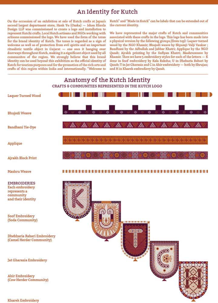
Showing the various crafts incorporated into the logo
Another aspect to consider was the contradiction between the simplicity and minimalism of the logo versus that of the sensibility of traditional communities, where intricacy and detail are valued more because of the workmanship and refinement. That the colloquial word for embroidery is bharat kaam or “filling work” further supported the need for an ornate and detailed logo to represent the richness of the myriad Kutchi crafts.
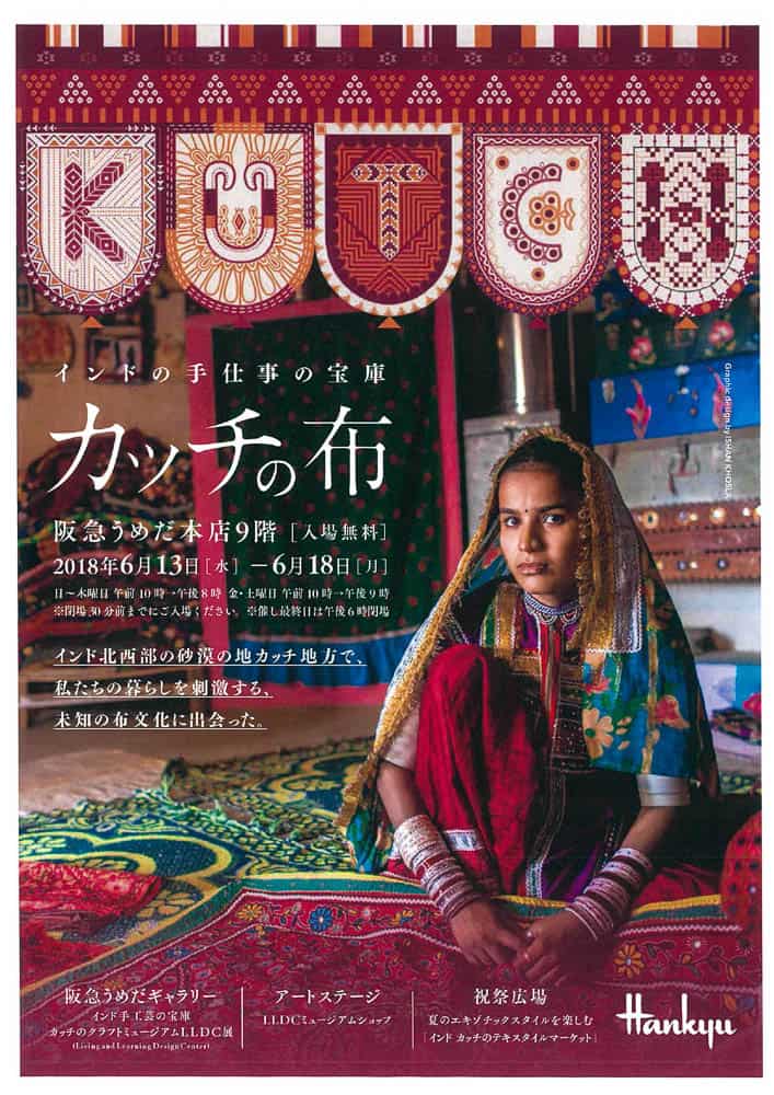
The completed digital toran logo in use in a Hank Yu catalogue
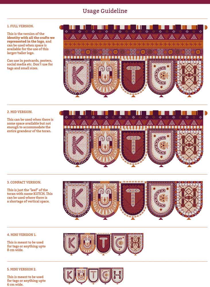
In addition to the highly detailed “full version” of the logo, we have also created several simpler, pared-down versions to be used for smaller applications such as in tags or labels (Figure 4). If the logo does get accepted as the official identity of Kutch, we can create many variations where more crafts such as rogan art, split-ply braiding, wood carving etc., as well as more types of embroideries from other communities could be incorporated.
The crafts
Judy Frater, Founder Director, Somaiya Kala Vidya, states that embroideries are critical in marking communal identities and creating a distinct relationship to other communities. Dress immediately communicates to the neighbours the fact that a person belongs to a particular community. Embroideries also vary according to whether a woman is married, unmarried or widowed. But they are much more than that: they are languages that have a vocabulary of motifs, designs, styles and stitches unique to each group.
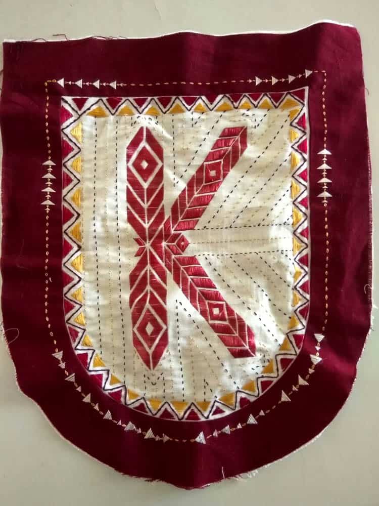
We decided to use five styles of embroideries in each of the five letters of Kutch, which would be done on the leaves of the toran. Even when we worked on the digital version, we made sure to understand the system and style of motifs, designs especially the types of stitches used in each of these embroideries. The embroideries were the most challenging to work with of all crafts as we were making letters out of them while staying true to their characteristics. During the making of the physical version, a lot of detailed feedback was given by us to the NGOs.
-
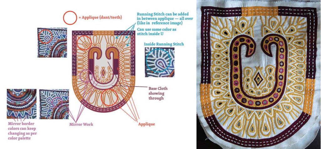
- Inputs given by us to one of the NGOs using the digital Dhebharia Rabari “U” with image references to actual Dhebharia Rabari work indicating the use of embroidery and applique to different parts of the U.

Each type of embroidery is created differently. Some, such as soof, Jat and kharek are grid-based while others such as Rabari and Ahir are not grid- or count-based. These are more rounded and organic in form than the more geometrical and rigid grid-based embroideries. Each embroidery also had its own system in terms of which type of stitches were commonly being used. For instance, chain stitch is heavily used in Ahir embroidery
Apart from soof, most embroideries are easy to work with in terms of being able to create typography based on the existing system of embroidery. This applies both digitally when creating the logo and physically when creating the toran. Soof was a challenge as it is based on the warp and weft count of the base fabric. To get the correct proportion of the letter, one has to select a base fabric with a warp-weft grid that is amenable to the digital design. Even then, the actual embroidery can never match the digital version.
-
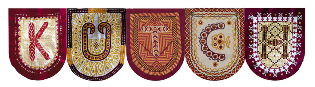
- Completed embroideries of the five letters

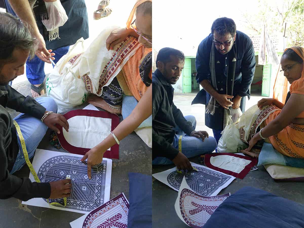
Once the digital logo was completed, a physical toran was constructed for the show in Japan. We decided to make this a large toran with “pillars” to encompass the entranceway of a mud hut being made at the Hanku Yu store in Osaka. Working with the various groups has been fulfilling though challenging.

The embroideries were made by artisans from the three NGOs: Kala Raksha, Shrujan and Qasab. As with the digital counterpart, we decided that the K would be in the soof style of embroidery; U would be Dhebharia Rabari; T would be Jat Gharasia; C would be Ahir, and H would be kharek.
Apart from embroideries, we worked with Khamir on the mashru stripe weaves and we also engaged with renowned artisan-designers: Sufiyan Khatri for Ajrakh block-printing, Shyamji Vankar for Bhujodi weave, and Abdullah and Jabbar Khatri for their exquisite bandhani tie-dyed fabric.
With over ten thousand crafted objects on display, the Kutch exhibition will be the largest ever show of Indian handicrafts in Japan. I do hope it captures the hearts and mind of the people of Osaka and of Japan. In an age of AI and mechanisation, it is the handmade which has become a rare luxury. Crafts have become more important than ever — as they transcend barriers of ethnicity, break stereotypes and promote a greater understanding of peoples across the world. The support of handmade goods not only provides artisans with livelihood but also gives them confidence to try out new and innovative ways to engage with their own skills. A successful show would give a boost to the artisans and various craft organisations, not only in Kutch but also elsewhere. I am optimistic that the visual identity of Kutch and its physical counterpart, the toran installation, will be appreciated and will hopefully engender a greater understanding of the myriad communities and their intricate crafts, in this mythical land of Kutch.
*The names of artisans I have from the various organizations are: Nirmala Kunvar Bhanani (soof), Rukiyatbai Abdul Jat (Jat Gharasia) and Dimpal Rajeshbhai Loncha (Ahir).
Author

Ishan Khosla (b. Kochi, 1976) is a visual artist, a design researcher, practitioner and author, and with an MFA in Design from the School of Visual Arts, New York. After studying and working in the US for more than a decade, Ishan moved to India in 2008, to start Ishan Khosla Design — a multi-disciplinary company that examines and experiments with various aspects of contemporary Indian culture through the language of design. Ishan was a speaker at Typo Berlin in 2017, TypoDay 2018 (Beauty and Typography) and conceived and moderated a panel discussion on Indic Type Design at Kyoorius Design Yatra in 2017. Previously, he has spoken at Semi-Permanent (New Zealand), the Gyeonggi Ceramics Biennale (South Korea), Maison des Sciences de l’Homme, France; Japan Foundation (Tokyo and Delhi); Aalto University (Helsinki); Konstfack University (Stockholm); The Powerhouse Museum and the College of Fine Art (both in Sydney); RMIT University (Melbourne) the University of Edinburgh (Scotland) among other places. He is a finalist of the Young Creative Entrepreneur Award by the British Council and has won the Blue Elephant for Best Book Design (Eye Spy Indian Art) at the D&AD Kyoorius Design Awards 2016. In 2012, two projects — Oz Fest (for branding) and Chittara Typecraft (for type design) were finalists in the D&AD Kyoorius Design Awards. Exhibitions include, Bold — Graphic Design from India at London Design Festival at the Rich Mix Cultural Foundation, London; Crossing Visions V: The Ecology of Creation, at the Fukuoka Asian Art Museum, Japan; Fracture: New Directions on Contemporary Textiles at the Devi Art Foundation; Porosity Kabari at Australian Design Center (Sydney) Nishi Gallery (Canberra) Australia and Studio X (Mumbai); Make it New Again, National Institute of Design, Ahmedabad; Common Ground at Gallery OED, Kochi and Edge Condition, Spitalfields Gallery, London.
Further reading
Rivers, Victoria Z “The Torans of Gujarat and Rajasthan: Meanings and Origins” Sacred Textiles of India, edited by Jasleen Dhamija; Vol. 65 No. 4, June 2014; ISBN: 978-93-83243-01-3, pp. 78-93